Visual Identity
Refreshed colour palette, type system, and iconography adapted for digital — maintaining brand recognition while modernising the aesthetic register.
A full corporate identity and brand refresh — completely overhauled visual strategy, messaging hierarchy, and modern colour palette to dramatically elevate market appeal and competitive positioning.
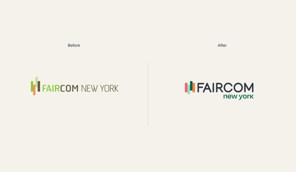
Faircom NY's existing brand had become visually dated — failing to communicate the firm's expertise and premium positioning to a sophisticated New York market. The complete visual identity needed to be reinvented while maintaining brand equity and client trust built over years.
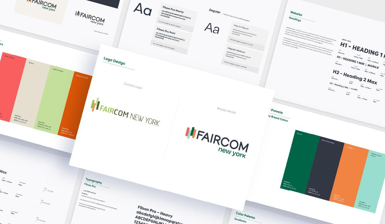
Starting from a blank page after a thorough competitive audit, I developed a refined visual identity — a restrained palette of deep navy and warm gold, a sharp typographic system, and a web design language that communicates authority without rigidity.
Evaluated existing visual identity, messaging, and competitive landscape to identify positioning gaps and opportunities.
Developed a new colour palette, typographic system, and visual language positioned for premium market appeal.
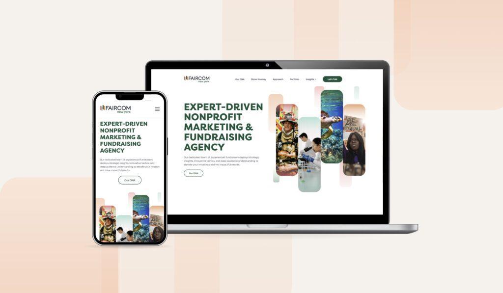
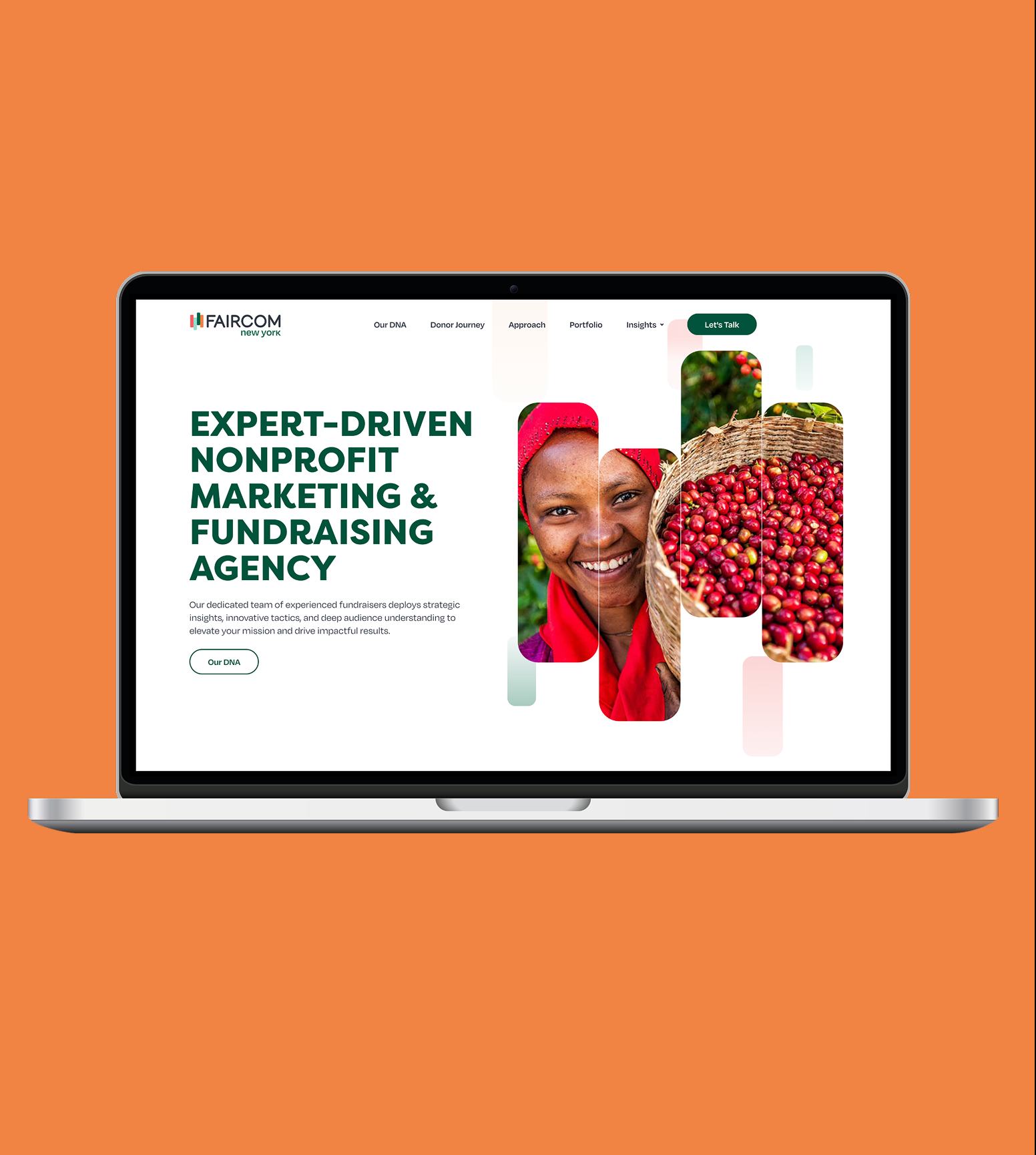
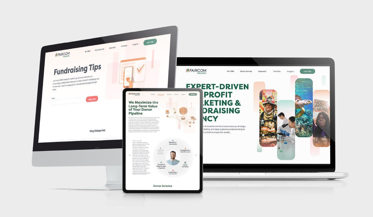
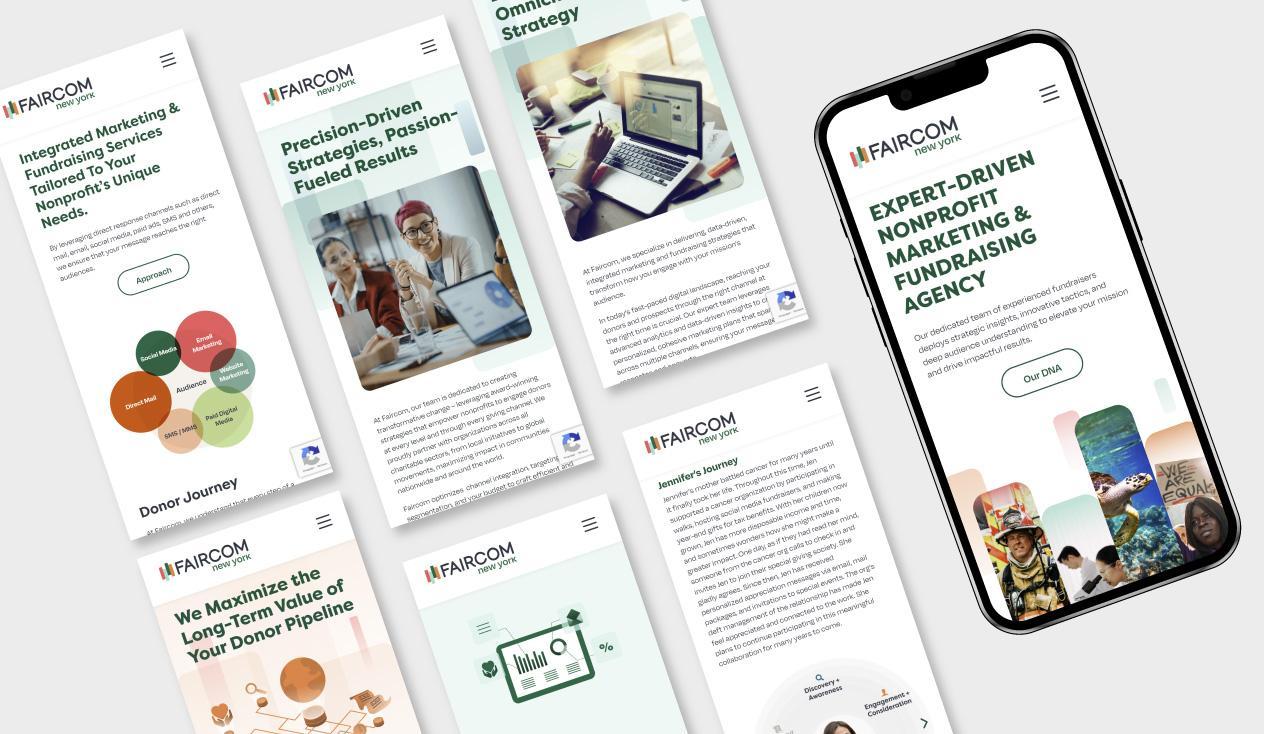
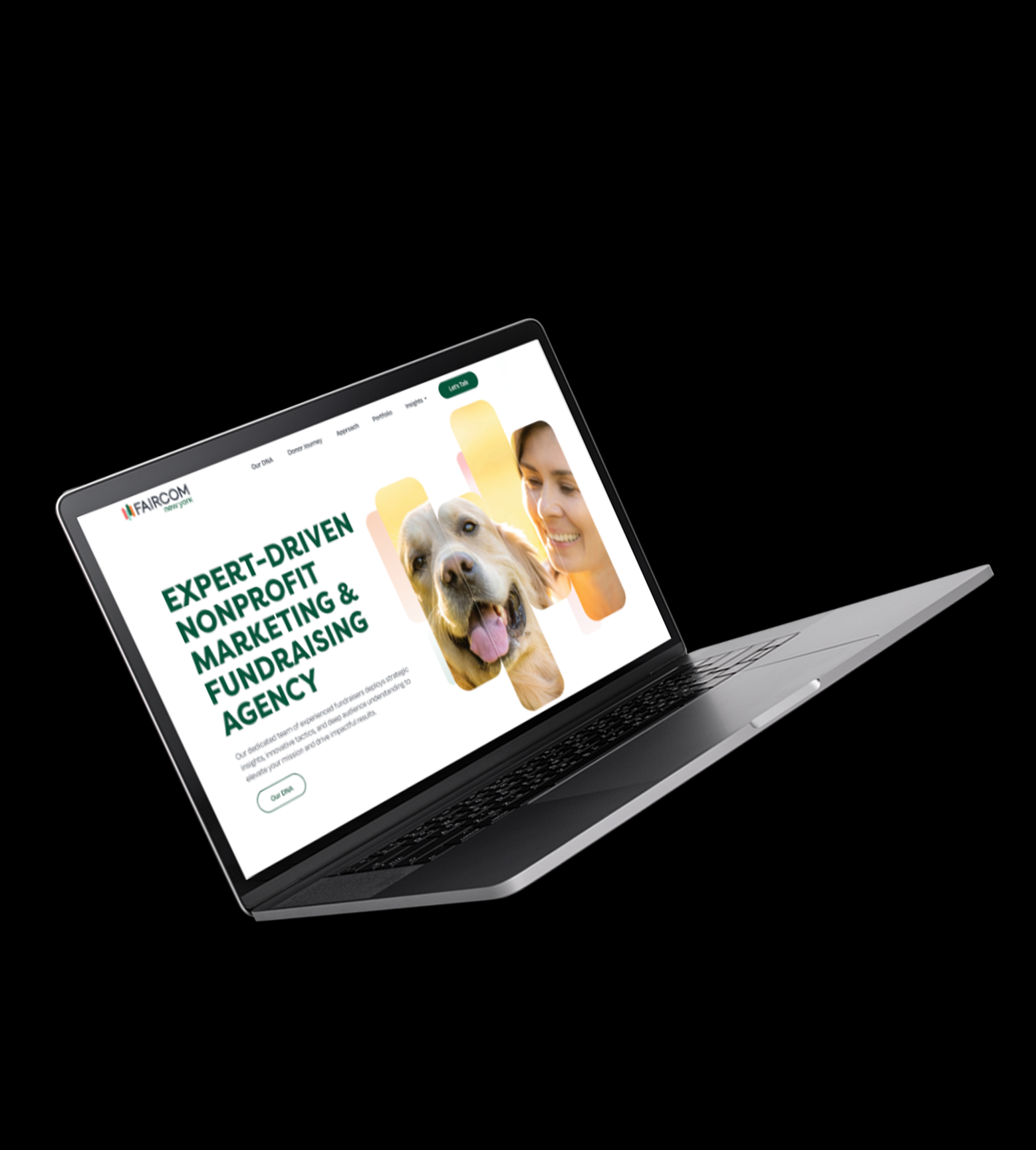
Applied the refreshed identity across all digital touchpoints — homepage, service pages, and team profiles.
Delivered a comprehensive brand guidelines document ensuring consistent application across all future materials.
Each design decision balanced aesthetic ambition with platform constraints and user familiarity — creating experiences that feel native yet distinctly elevated.
Refreshed colour palette, type system, and iconography adapted for digital — maintaining brand recognition while modernising the aesthetic register.
Mobile-first approach across three breakpoints (375px / 768px / 1440px). Fluid grids and flexible components that adapt without compromise.
Optimised asset specs, lazy-load patterns, and skeleton states designed in from the start — not bolted on as an afterthought.
Brand system: colour · type · iconography · web
Increase in inbound enquiry rate post-launch
Accessibility compliance across all digital assets
Live — brand guidelines adopted across all channels